Offline
|
EST 21:18:47
|
Toronto

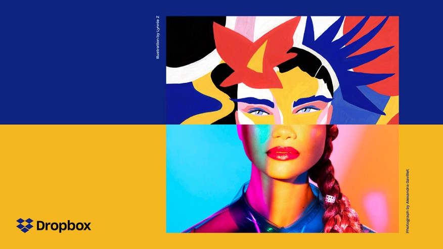
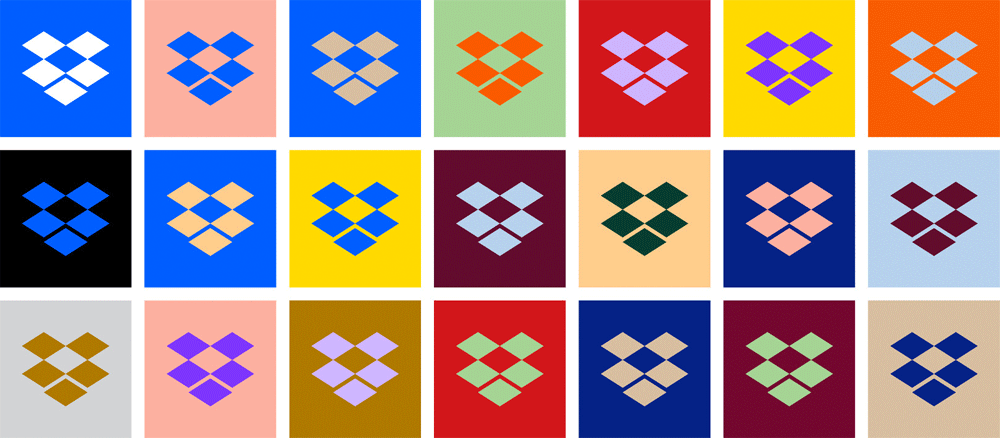
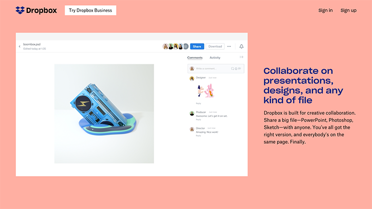
It looked like Dropbox was going to be the next big thing. When they launched, they introduced a new type of technology to the public that changed the way they thought about how they use computers. The best stories in technology start like this. The next few years were interesting. Every major platform holder followed suit, making file-syncing a marquee feature of their upcoming product launches, appearing as though caught in headlights by this modest little product. Dropbox quickly grew, launching team features, acquiring like-minded companies that gave the appearance that they were on the path to launch a suite of products that would usurp the crown of productivity from Microsoft and Google in the name of smart, cloud-based storage. However the tide turned as Google and Microsoft drastically undercut their pricing, and the stalwart software giants were able to retain their foothold on the productivity market. Dropbox shut down Carousel and Mailbox, turning away from its once hopeful suit of products back towards its singular marquee product. And in 2017, it rebranded from a file-sharing services for “knowledge workers” to one for “creative workers”.
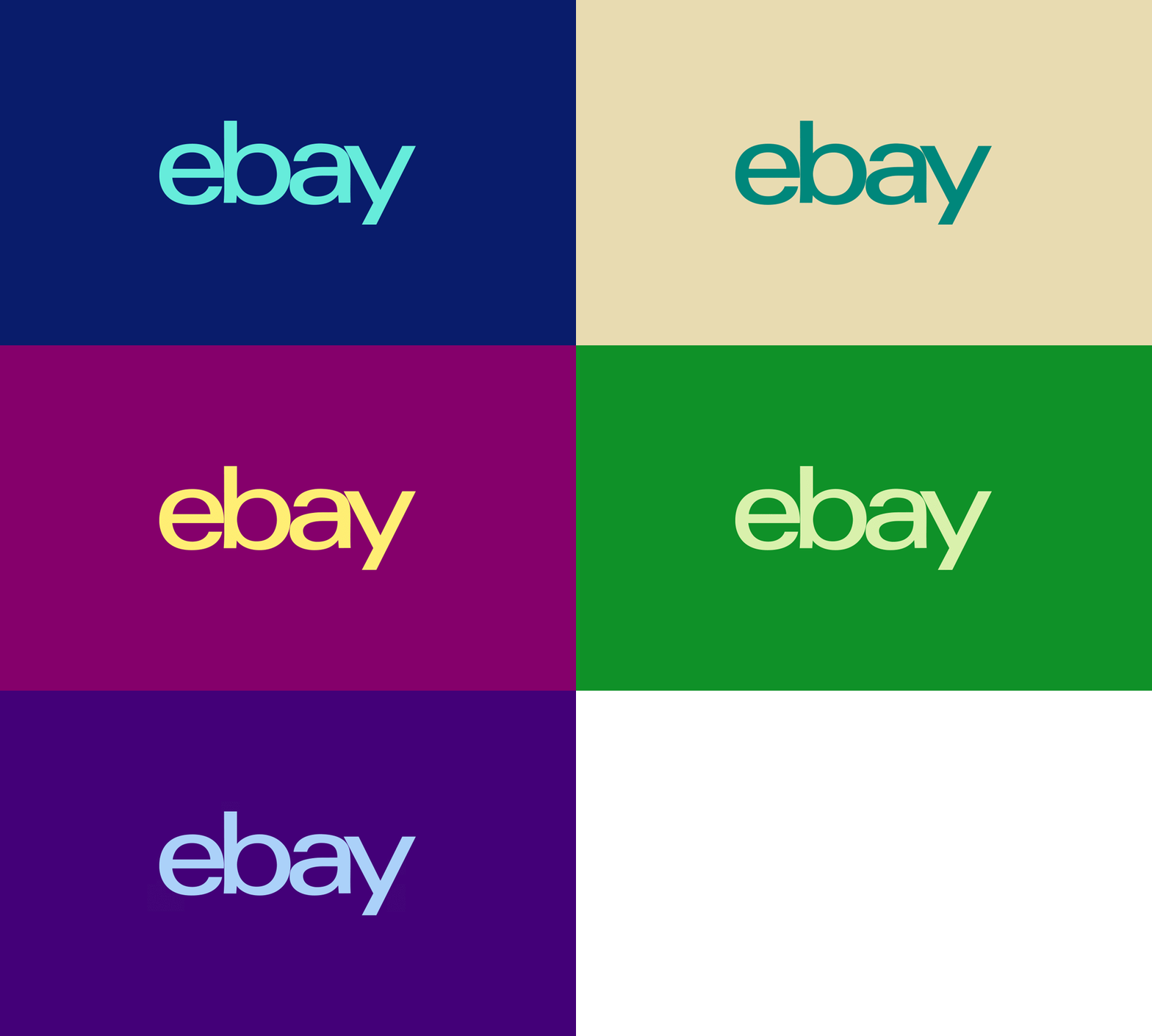
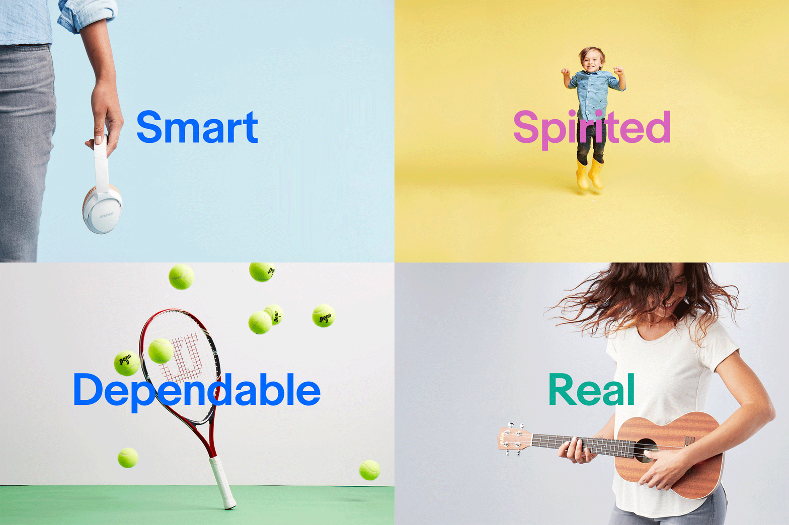
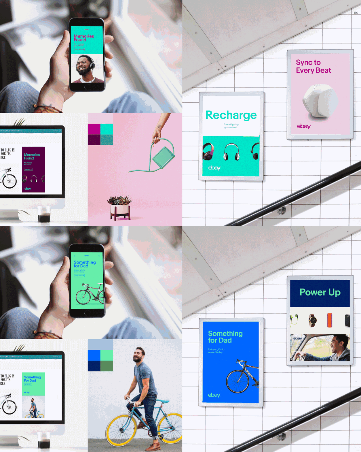
Within a few weeks of the launch of Dropbox’s new brand, Ebay brought out their own new look. It’s less severe than Dropbox’s drastic new aesthetic, but it evokes similar feelings. It’s less direct in it’s focus on artists and creative professionals, but it strikes the same chord. It has as much in common Dropbox’s refocused brand as it does with what Eliza Brooke of Racked describes “Startup minimalism”, which is detailed here:
sans-serif lettering, neatly presented in black, white, and ultra-flat colors. Cobalt, for example. Its goal is noise reduction, accomplished by banishing gradients, funky fonts, and drop shadows, and by relegating all-caps to little “BUY” buttons. The abundance of white space around words, photos, and playful doodles exudes a friendly calm. You’ll find the information you need in seconds, and what a pleasing few seconds they will be.
My favourite quote from her piece is the following:
…One of the remarkable features of startup minimalism is its flexibility. It can sell anything.
Which is certainly apt in Ebay’s case. There is a distinct timeliness to the look, and it has as much to do with the trends of e-commerce as it does to Ebay’s status within it’s market. Like Dropbox, Ebay was once heralded as being the future of technology. A pioneer of online shopping, they devoured PayPal to create what looked to be poised as a giant of digital commerce. But their ambitions now seem small, especially when compared to their closest and most aggressive competitor, Amazon. Now, 25 years after opening their doors, they appear quaint; The likeable, but forgettable cousin of Craigslist. As a result, their positioning has changed. If they can’t have everyone they can have you: the person who isn’t like everyone.
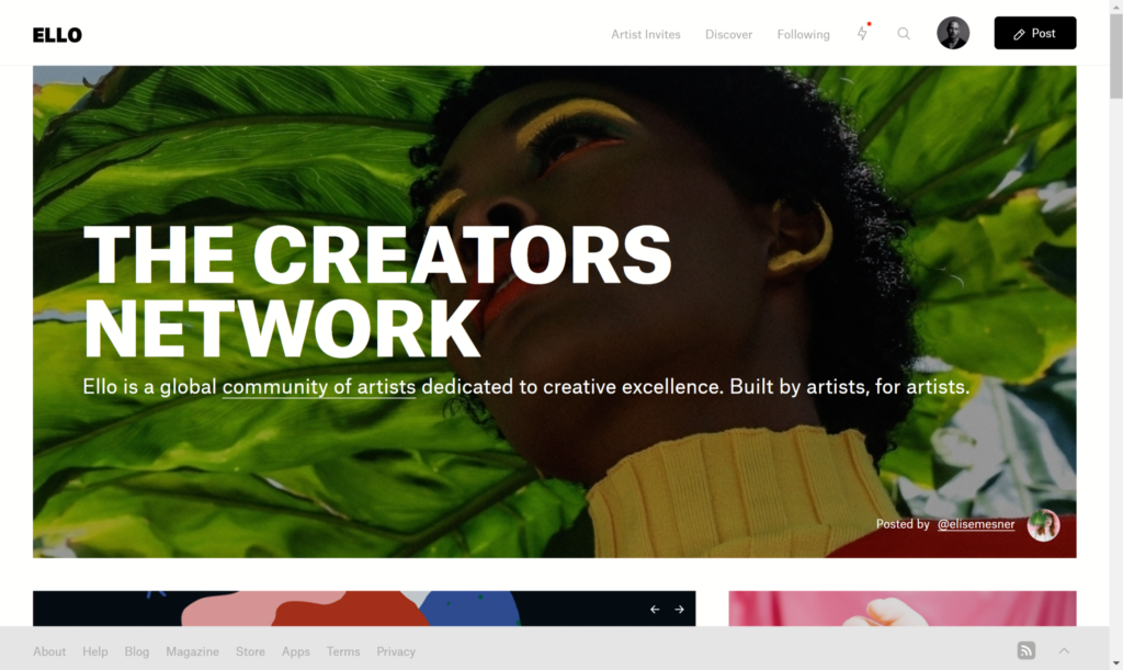
This is a trend you can see in technology going back at least 20 years. In 1997, at it’s rock bottom marketshare, Apple decides that it’s products aren’t for everyone, just “The ones who see things differently”, “The misfits, the rebels”. in 2017, in the same position regarding hardware, Microsoft targets “the Mac’s oldest stronghold: creatives” with the Surface line of devices. Ello, the small social network originally over-hyped as the next Facebook, found it’s true home with designers and artists, following like likes of Tumblr instead.
VSCO, the image-editing company, equally was reported on as the next Instagram and instead kept it’s focus on creative individuals. Virb, Vimeo, Myspace all have similar paths. They all at one point were billed as the next big thing, and upon reaching their zenith, had to change trajectory and find new meaning for their companies. In all of these cases, this meant focusing on a small but desirable, self-identifying target group: artists.
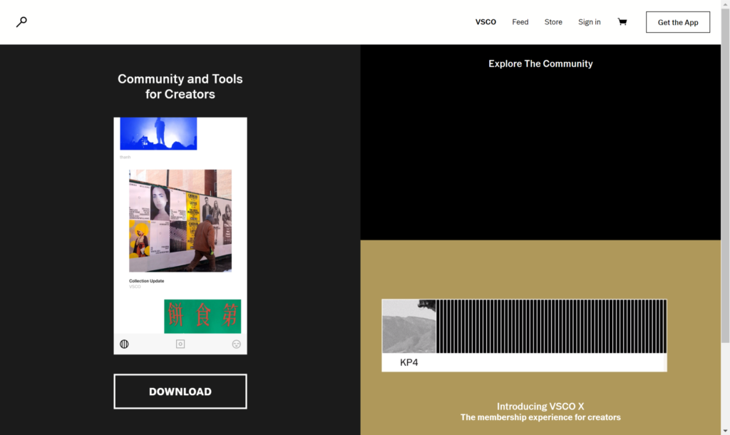
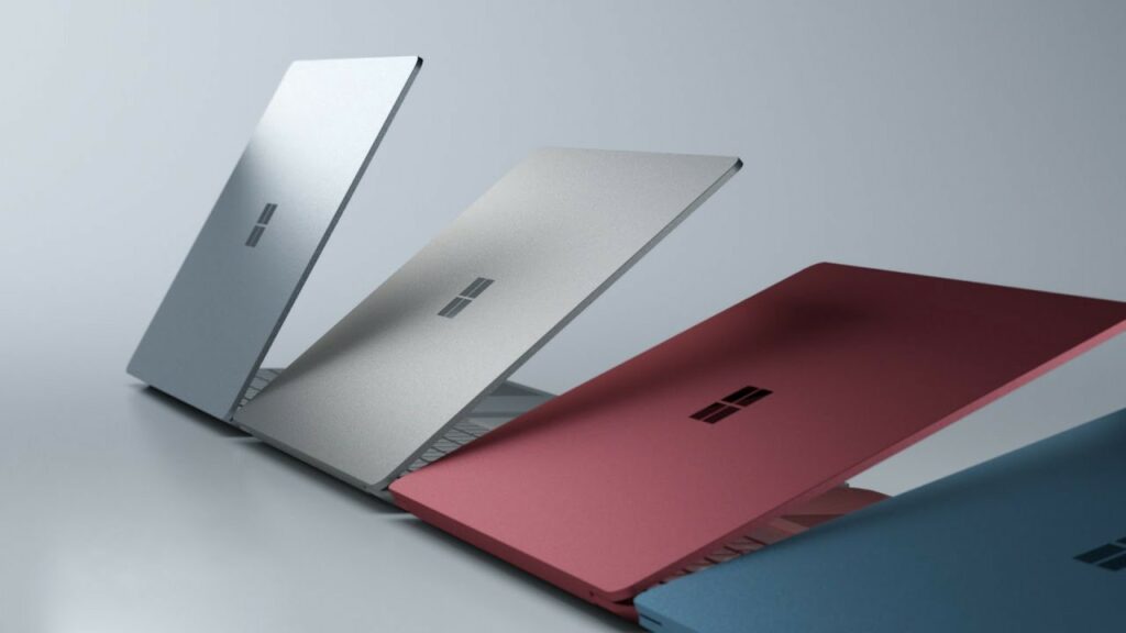
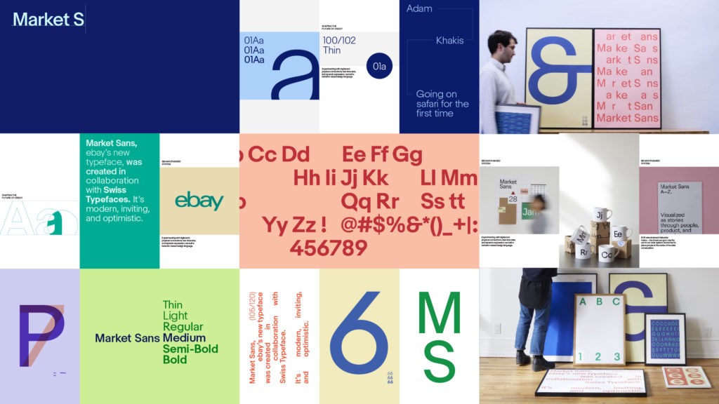
What’s interesting here is the aesthetic transformation, and the shared details in their execution. These companies all became more interested in editorial content, and adopted a visual language that looks visually distinct from their mainstream counterparts.
In 2017, this is what alternative looks like.
Flat colours, picked just outside of the range of primaries and secondaries give us muted golds, cobalts, lime greens, goldenrods, corals, aquamarines, eggplants. High contrast use of black & white is used wherever low-contrast colour-on-colour isn’t. Sans-serifs, the staple of post dotcom technology are used liberally, in bold geometries that give a non-committal-Scandinavian feel. They are constructivist in their structure, but not so much that it breaks with our understanding of modern technology or marketing. The typefaces are severe, but they have character, using letterforms that are deliberately stark, but have quirks that ensure you never confuse them for Gotham, Avenir or any other sensible sans serifs. These are typefaces that want you to feel like you are being challenged by their appearance, but are still, my any measure of readability or legibility, easy on the eyes.
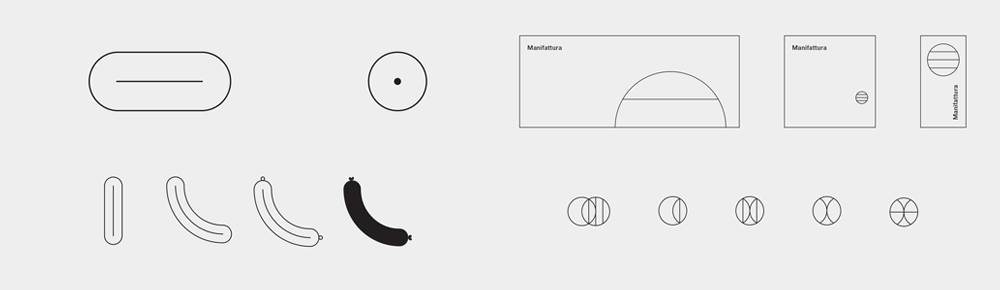
The graphic systems are all equally rigid, relying on visible grids and sharp contrast in shape. Often creating a marriage between circles and squares, with rare exploration outside of those two perfected forms. There is an interplay between the hard-lined outlines that use think keylines and comfortable margin and the visual content, where images almost always run right up to the edge of one-another.

When photography is used it’s palely studio-set, with the flat colours used throughout the brand making up the backdrop for wide shots of humans in abstracted situations of normalcy. Echoing this benign austerity that makes up the colour palette and the typography. It’s harmonious and human, but graphic with sharp edges. On a tight-rope between being fun and being prickly, landing somewhere that can be described as sophisticated but quirky.
All of that said, I don’t have any negative feelings about the trend, nor the design work done by Form&, Collins or any of the other designers involved. In fact, I am typing this on a Surface Pro, and am an active and happy user of VSCO and Ello. These redesigns are sharp, professional, well-executed, and stand out (albeit in their respective markets rather than from each other). I think they are an excellent solution to a very real problem that a lot of businesses face. However when each brand solves the same problem in the same manner, a new problem arises: When these new identities are positioned on standing apart, what happens when they all look the same?
One thing I’ve learned from the last five years is that there’s no way to know what’s coming next. Will there be another new global illness? Will our reliance on the Netherlands’ barium and/or cocoa butter supply cause a supply chain crisis? Each outcome feels as likely as any other. That being said, there are a few things that we can point to as likely, pending a global cocoa butter catastrophe.
For one, in the last five years, we’ve seen a return to expressive design. It’s been a decade since the pivotal iOS 7 moment that shook the cobwebs from an entire industry. What followed was a mass reset of expectations — the line between wire frame and finished design blurred, and iteration replaced culmination.
Over time, we started to crack the door open to expressive design once more and embrace decorative display typefaces, emotional colour choices and expressionistic UI patterns. Moving into the next five years, the pendulum will start to swing the other way. After all, iOS 7 came out of the ripple effect of the last major recession. Austerity was in vogue, and so minimalism, self-selected uniforms, geometric type and high contrast colour became de rigeur. Now that we are entering another moment of economic tightening, the maximalism of the current era will swing back towards simplicity and curation.
We’re already seeing it in certain areas of design: In the automotive industry, mass-market hallmarks like the Honda Civic and Toyota Prius have been redesigned to be straightforward and stripped down; a massive departure from their previously overwrought bodywork. Generally, we’ll see this tightening of the belt continue. Typography will once more become practical — goodbye exaggerated inktraps and art deco display serifs — and we will see a shift away from decorative design towards the functional and practical. Quality and craft will become higher value priorities for a world that is more scrupulous about spending.
In addition to those economic factors, there’s also the cultural cadence of trend. If you subscribe to the concept of the 20 year cultural cycle you’ll notice the current self-aware resurgence of Y2K style, and echoes of the 80s. As we look towards the next five years, we’ll be revisiting the styles and fashions of the late aughts (I hope you enjoyed wide-legged pants while you could), and by extension, the cultural psychology of the late 80’s.
After a decade of disruption focused investment, we’ll see the entrenchment of incumbent powers throughout culture. You can again see this happening already in the automotive industry, where after the rise and fall of disruptive automakers like Lordstown, Faraday and Argo AI (as well as the continued spectacle of Elon Musk causing damage to the reputation and stock performance of Tesla) familiar stalwarts like Ford and GM benefit by staying the course in an era that otherwise could have seen their positions unseated. We’ll see the forced of corporate consolidation change from being top-down, driven by aggressive anti-competitive behaviour to a necessary survival tactic from smaller firms bidding to be acquired by more stable players. Traditional institutions, technological and financial, will maintain their position and power after the mainstream distances themselves from the once-viable crypto and Web3 markets.
Lastly, AI will continue to shift the technological landscape under our feet. There will always be a new, scary thing that threatens sense of stability, but as we’ve seen over and over again, from chatbots to deepfakes, we will become distracted by the next scary tool before the current threat has a chance to undo our lives. It has certainly been true that AI has become a viable, useful part of design over the last five years (even if the definition of AI in those applications is not quite accurate), but automation will continue to aid the designer rather than threaten them.
At Night Shift, we’ve already integrated tools like AI-powered transcription into our daily workflow as a studio, there are more tools on the horizon that will relieve the ongoing pain points of creative work. Some jobs will be consolidated, but human labour is typically reallocated rather than replaced, especially in the information sector. The idea that artists, writers and designers will be replaced by AI is not necessarily in the immediate horizon. Some types of work will be automated, but I know that some writers are looking forward to not having to take SEO writing gigs. If the robots can write for the robots, then humans can get back to writing for other humans. I’m interested in how automation could expedite creative conceptualization (once the delinquency around copyright has been factored in) and could be used to enhance our design process rather than usurp it. Ideally, as any good tool should, it’ll assist our design work and enhance it, rather than replace it. But for that, we will have to wait and see.
Workin' Hard Since 2017