Offline
|
EST 20:06:59
|
Toronto

Your friendly west-end neighbour
[Publishing]- Illustration
- Visual Identity Design
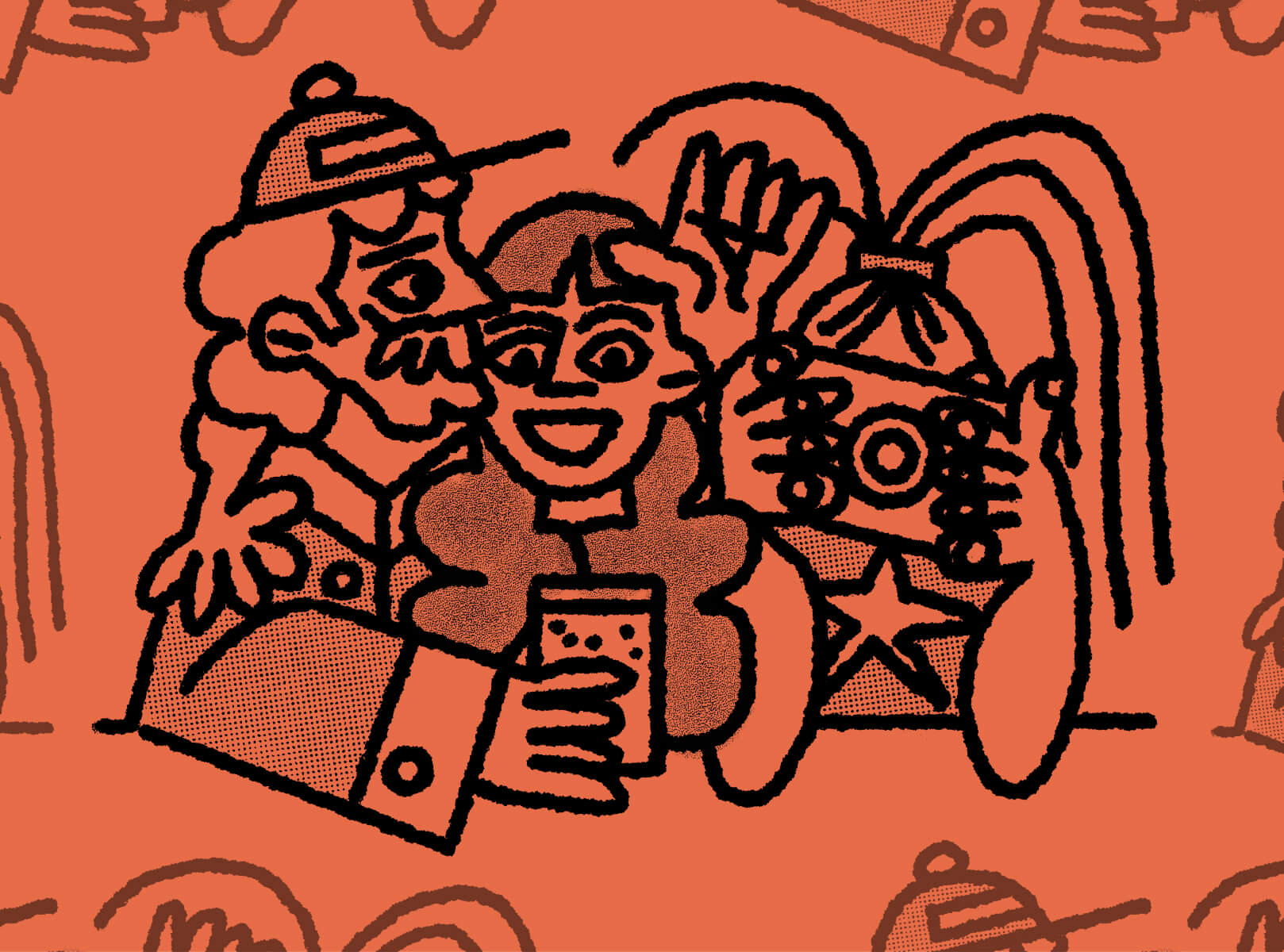
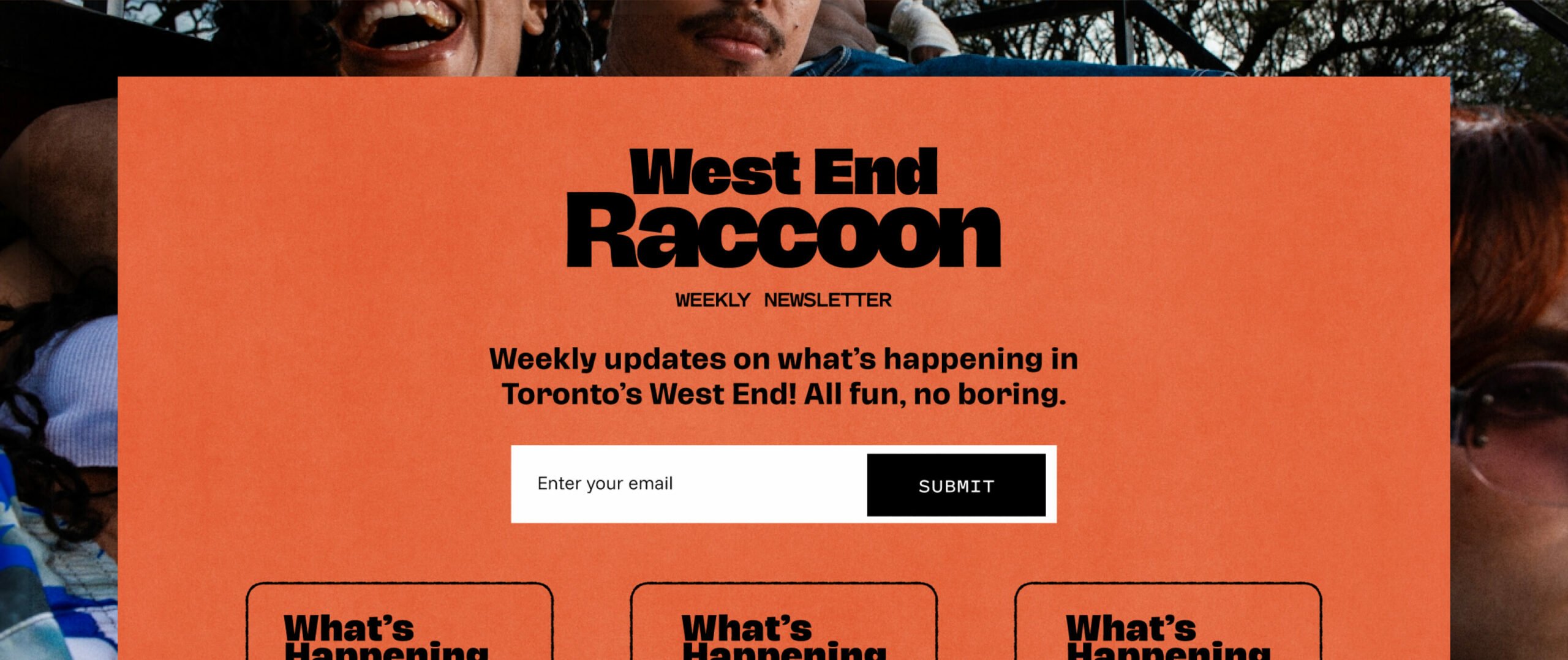
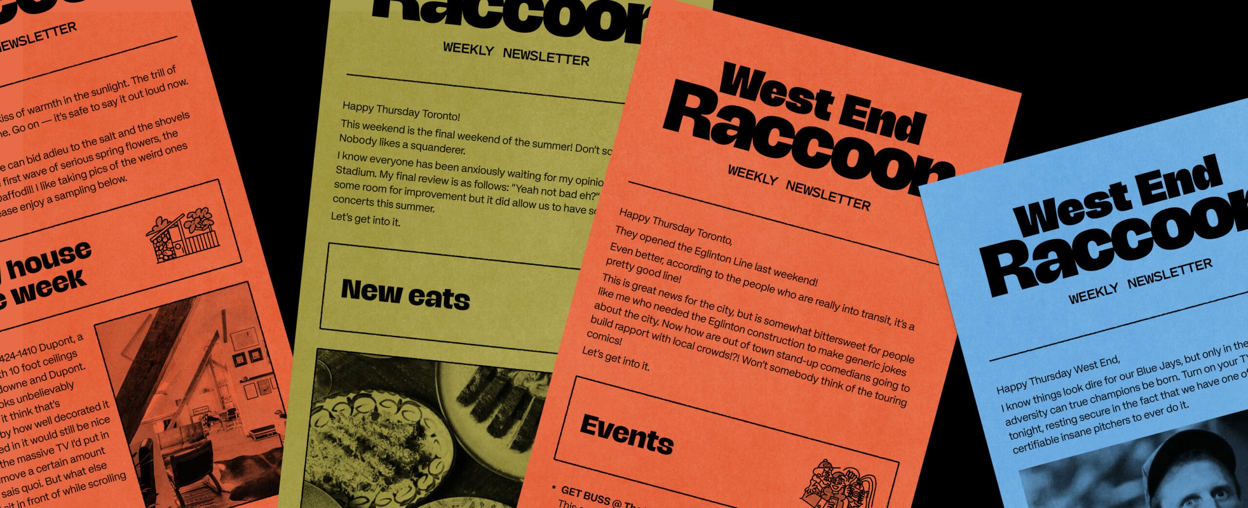
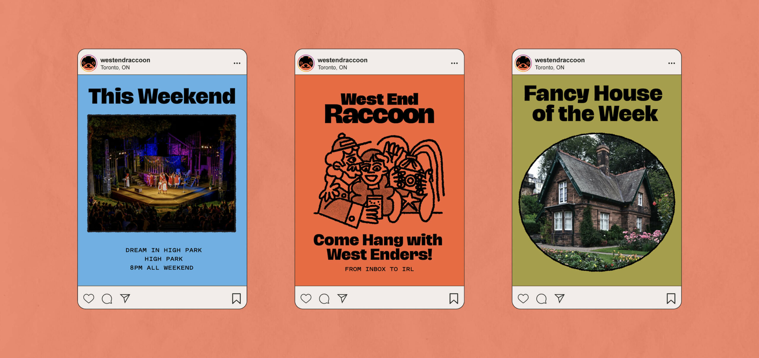
Meet the West End Raccoon—a weekly bulletin covering everything worth knowing in Toronto’s west end. Real estate, new restaurants, weekend plans. All that good stuff!
The Challenge
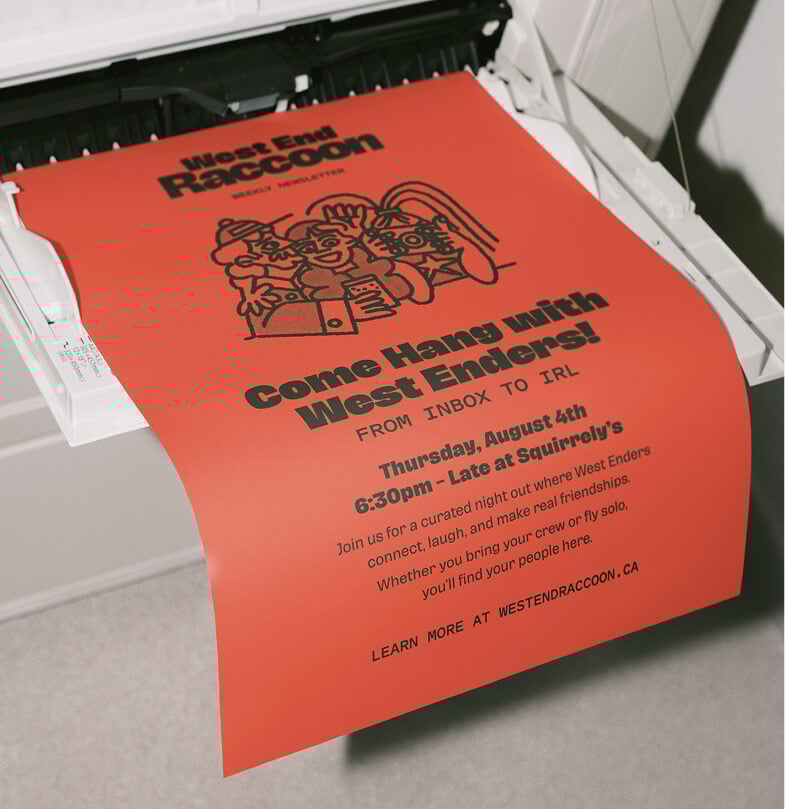
West End Raccoon needed a simple visual identity—that due to software constraints of email marketing—could thrive within a confined ecosystem.
The Approach
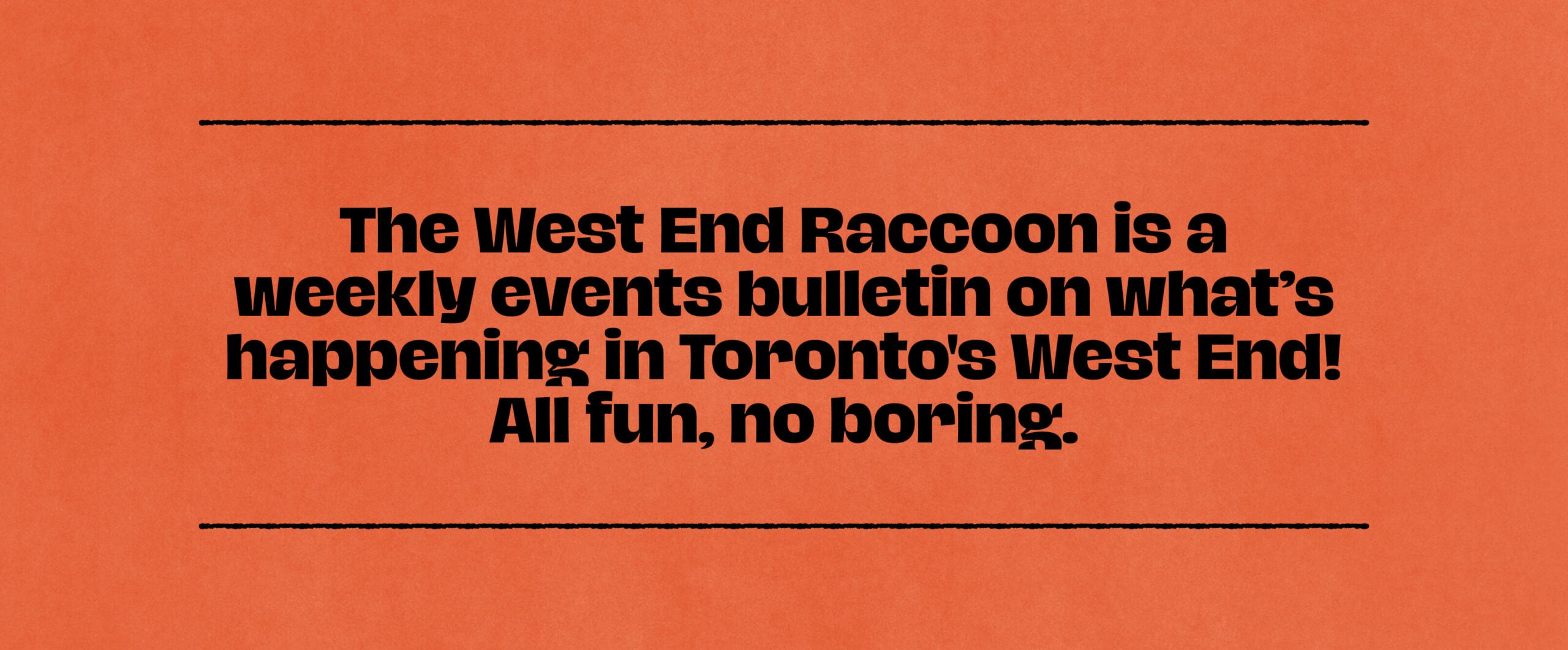
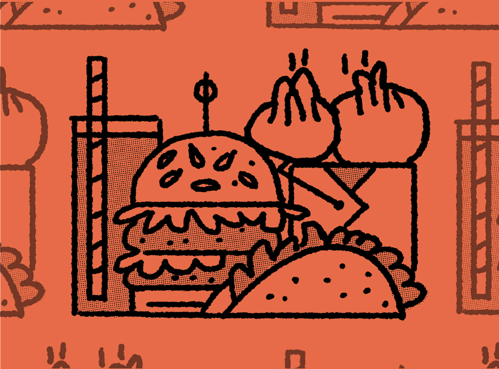
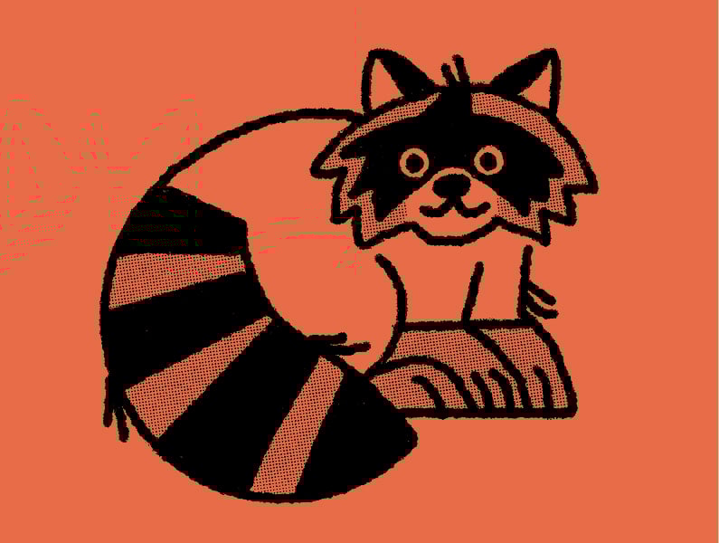
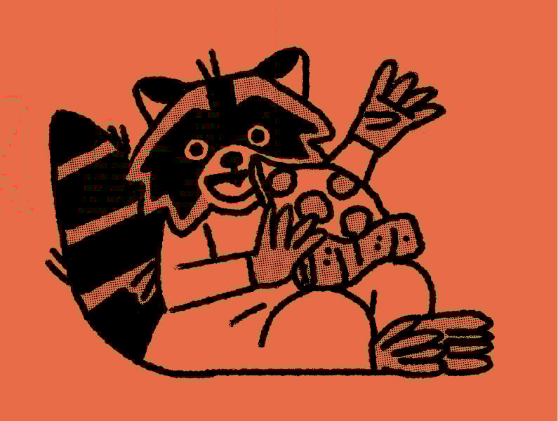
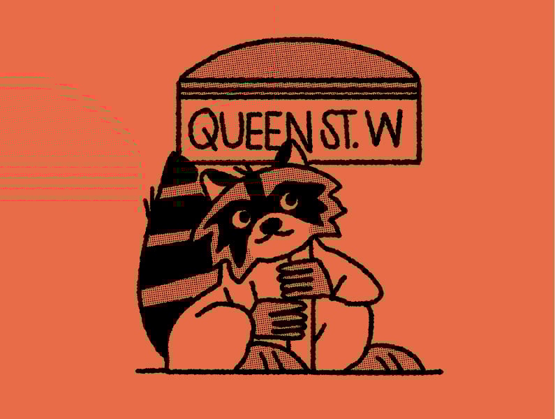
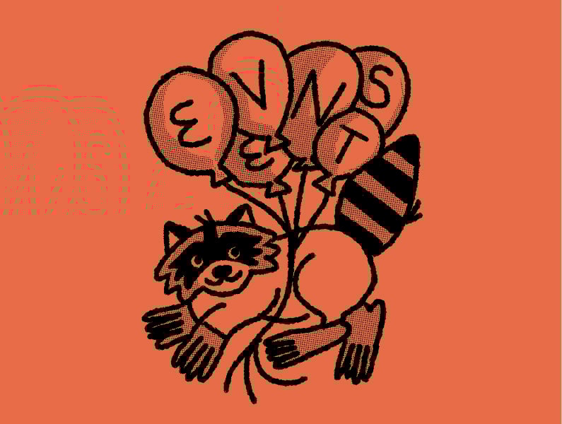
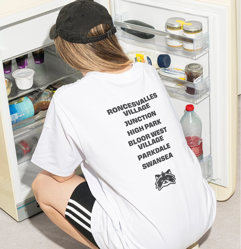
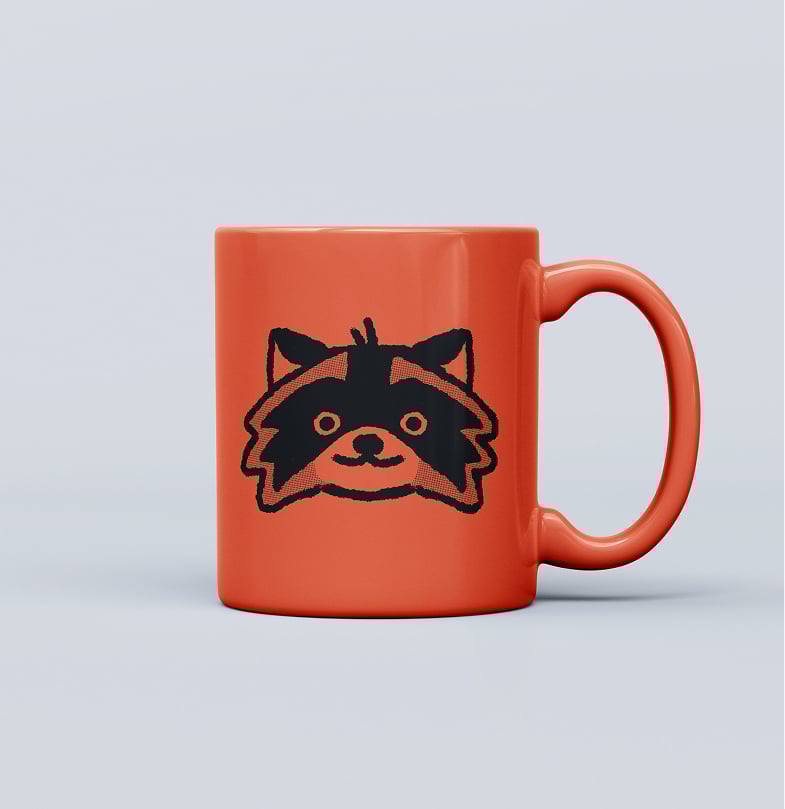
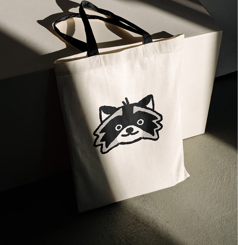
We helped to develop a visual identity that felt like the neighbourhood itself: DIY, curious, and a little scrappy. The logo packs tight like the streets it represents, with a retro warmth that feels like Saturday morning cartoons.
The Outcome
In less than a year, they grew from a humble mailing list of under 100 reader to still climbing readership of over 8000 subscribers.
The identity we landed on feels like it was photocopied at a local print shop and slid under your door on a Saturday morning. It’s wildly expressive, charming and playful. Overall the system is built to hold up whether it’s landing in an inbox or printed on a tote. It doesn’t need to try too hard, because it intended to feel local and non-corporate. The WER audience is a savvy bunch that wants real, honest and straight-forward.

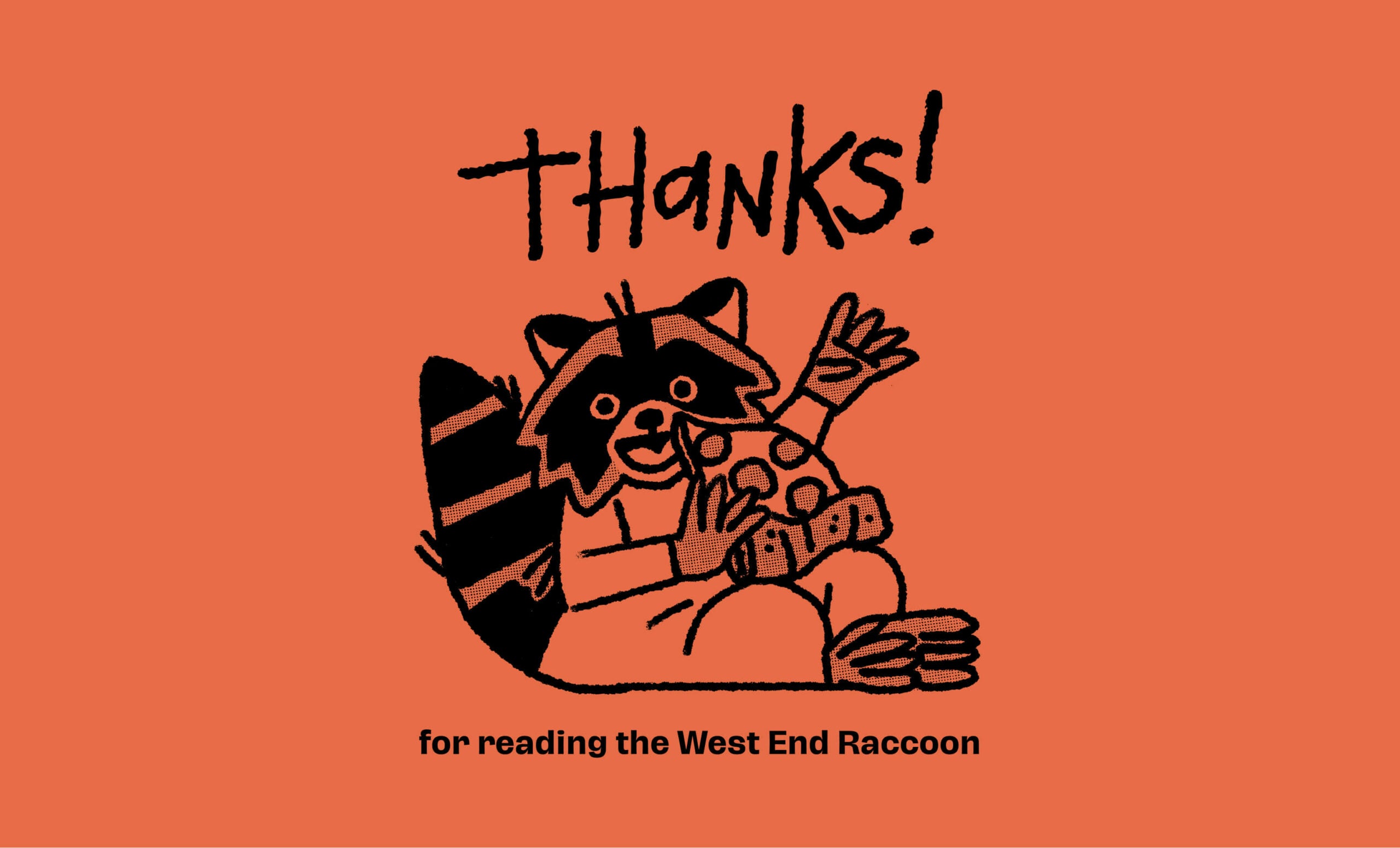
Many thanks to our fabulous partner
Xavier