Online
|
EST 12:16:45
|
Toronto

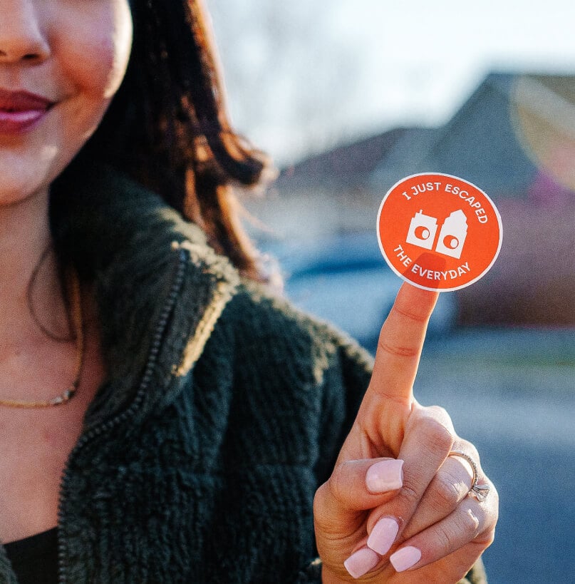
A Brand Worth Escaping Into
[Events]- Brand Strategy
- Illustration
- Photography
- Visual Identity Design
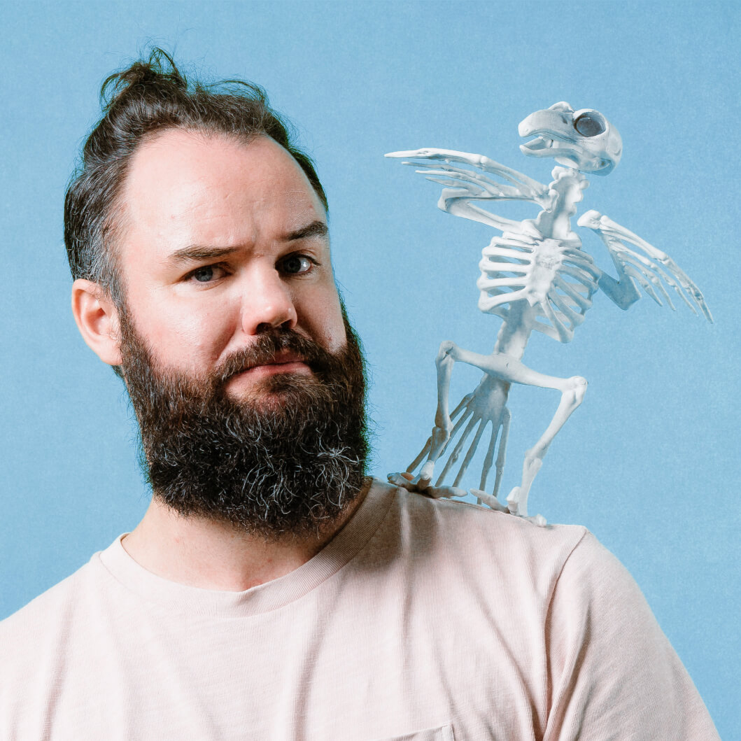
Secret City Adventures is Toronto’s leading creator of immersive escape rooms and theatrical games, the kind of experiences that make you feel like you’ve stepped inside a story. Since 2012, they’ve built a loyal following through meticulously crafted adventures set in castle towers, underground tunnels, and 1920s speakeasies.
The Challenge
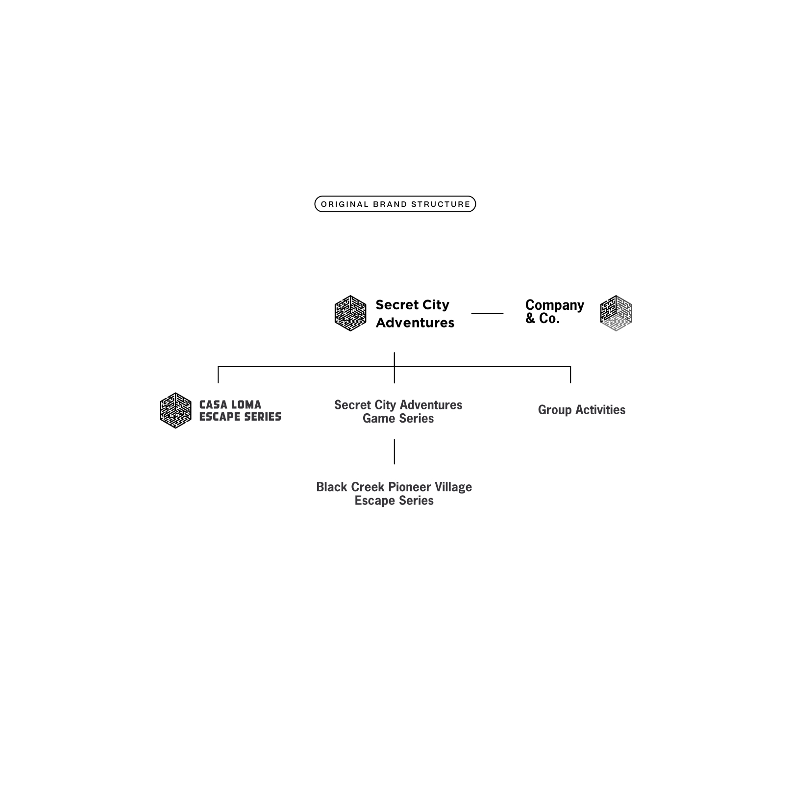
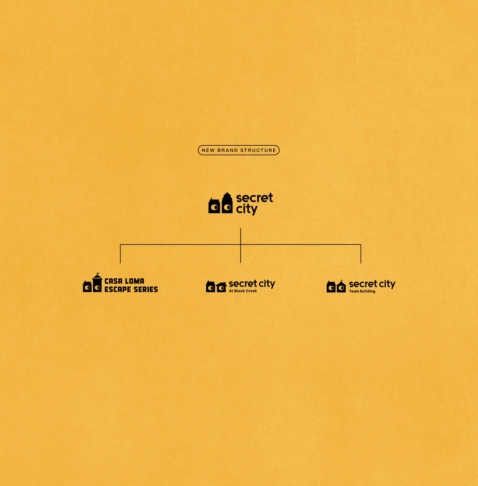
Years of ambitious growth had left the brand scattered. Multiple properties pulling in different directions, inconsistent naming, and a visual identity that wasn’t keeping up with the quality of what they were actually making. They came to us needing clarity.
Our Approach
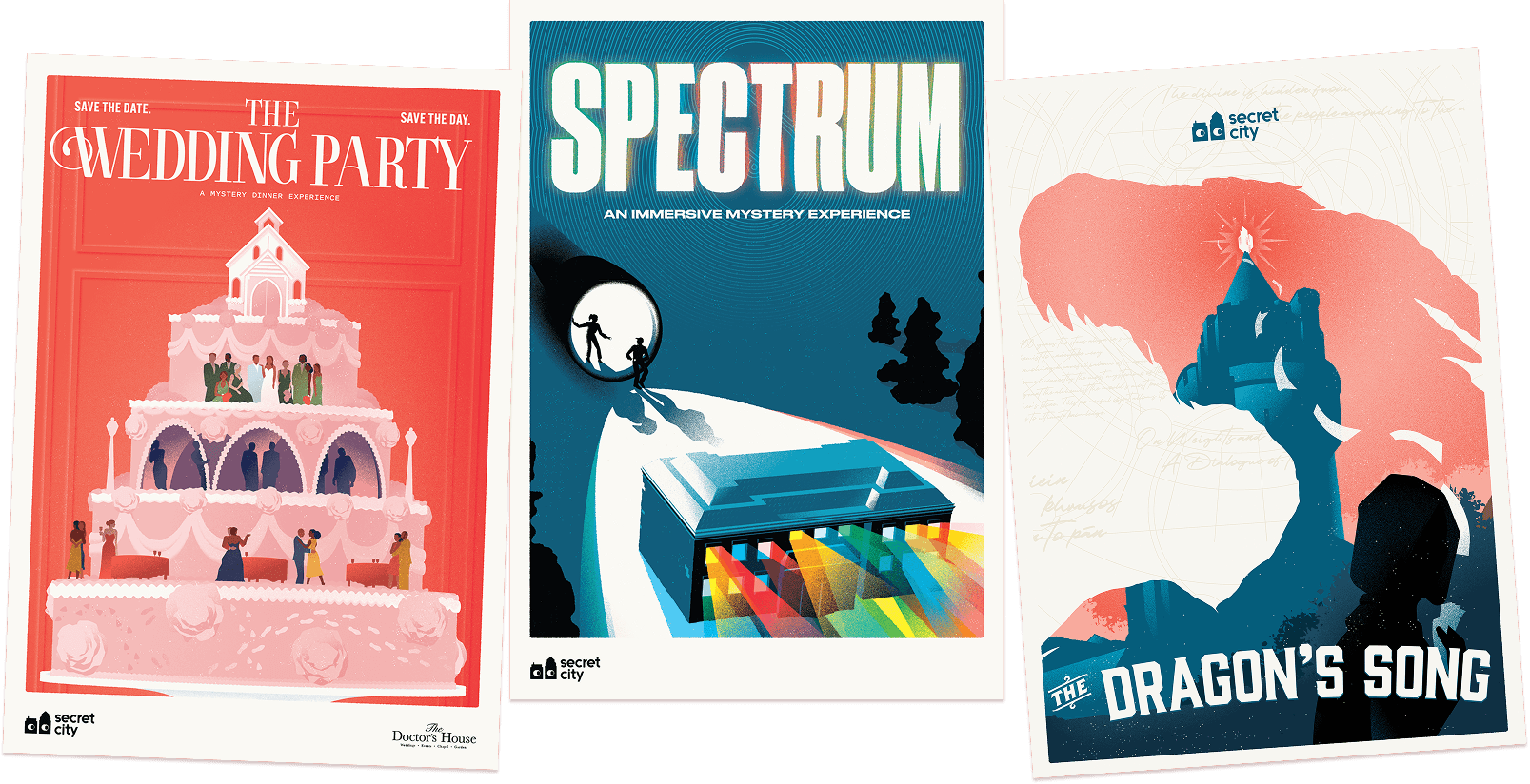
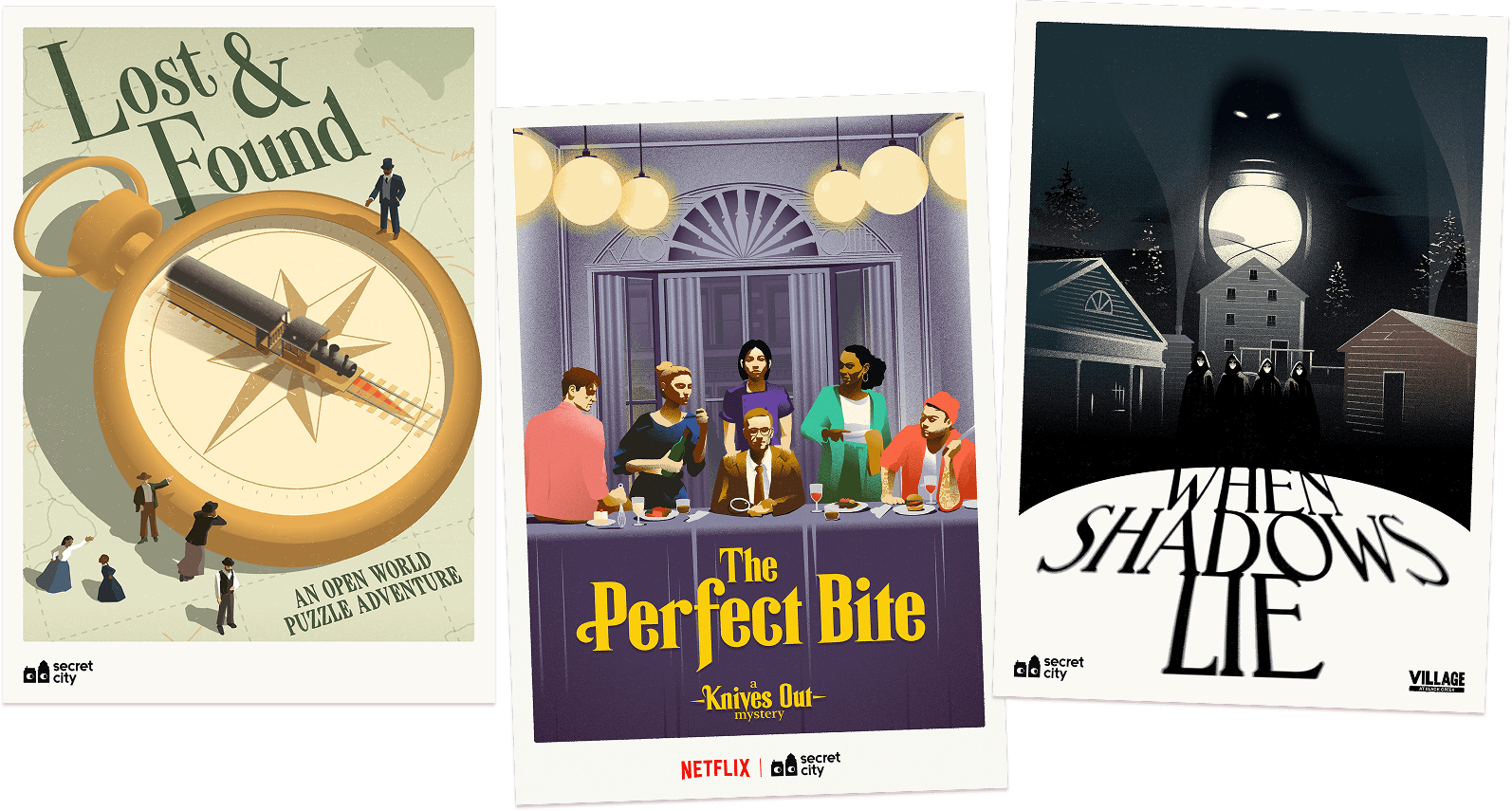
We started with brand architecture. Untangling their experiences under a single, cleaner Secret City name and separating their B2B design arm into its own distinct entity. With a clear foundation in place, we built an identity and key art system that finally matched the ambition and wit of their world.
The Outcome
Since the rebrand, Secret City has launched seven new games, expanded their team, and pushed into new territory with experimental dinner theatre. They’ve grown from a Toronto staple into an international name, with locations in Vancouver and London, UK. The partnership with Netflix followed. The identity gave them something to grow into.
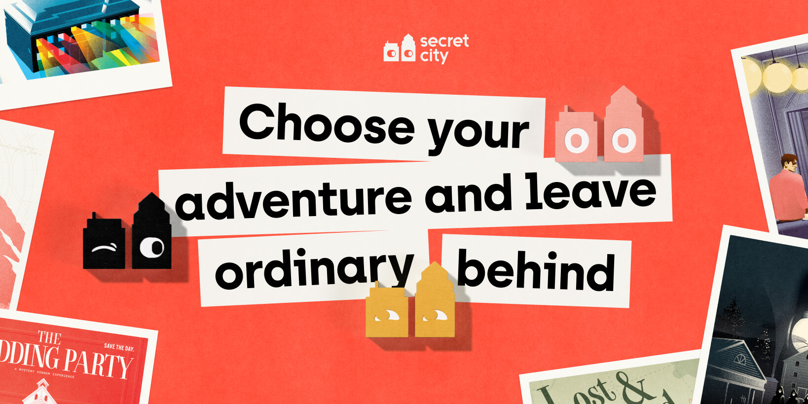
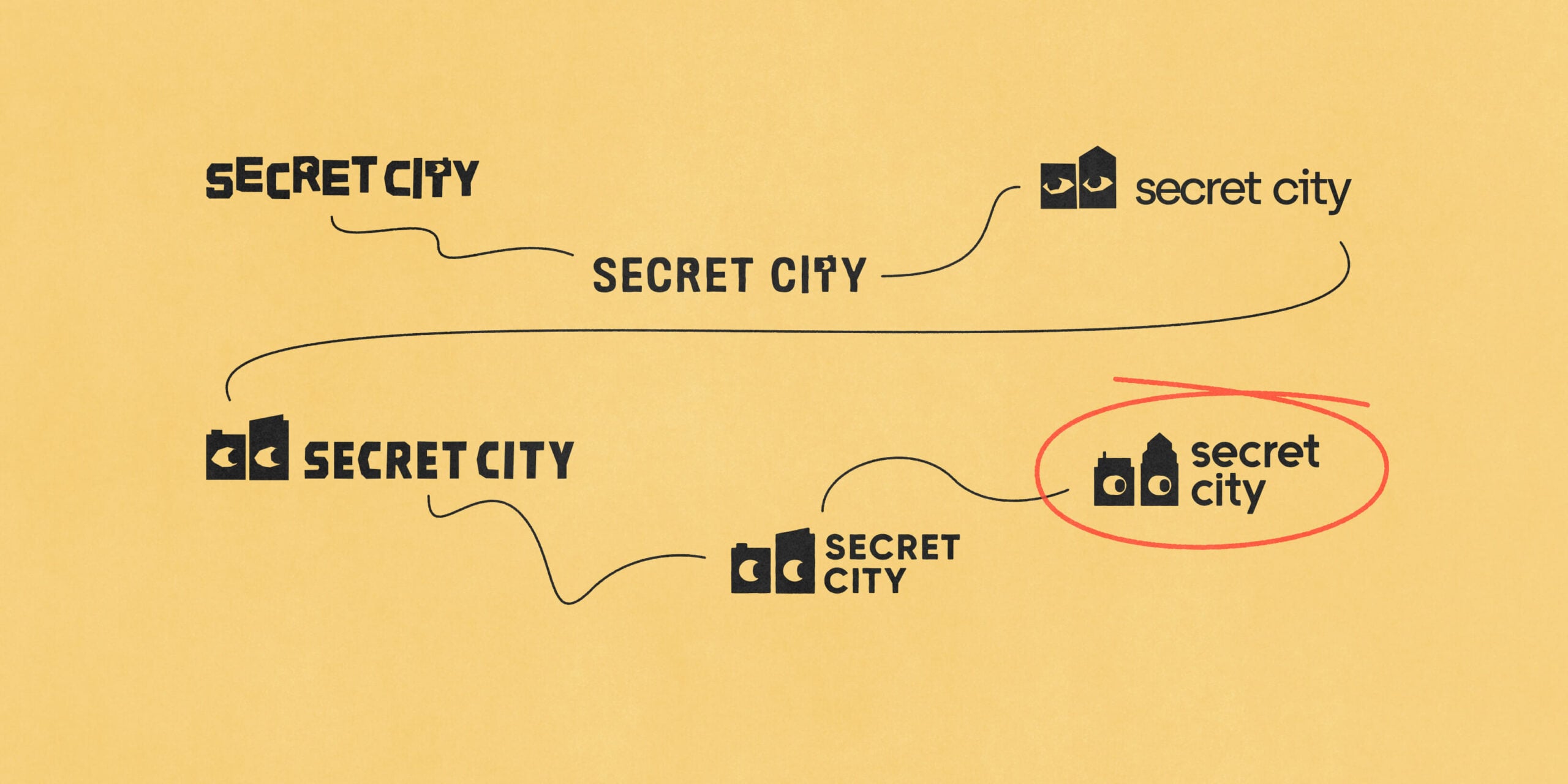
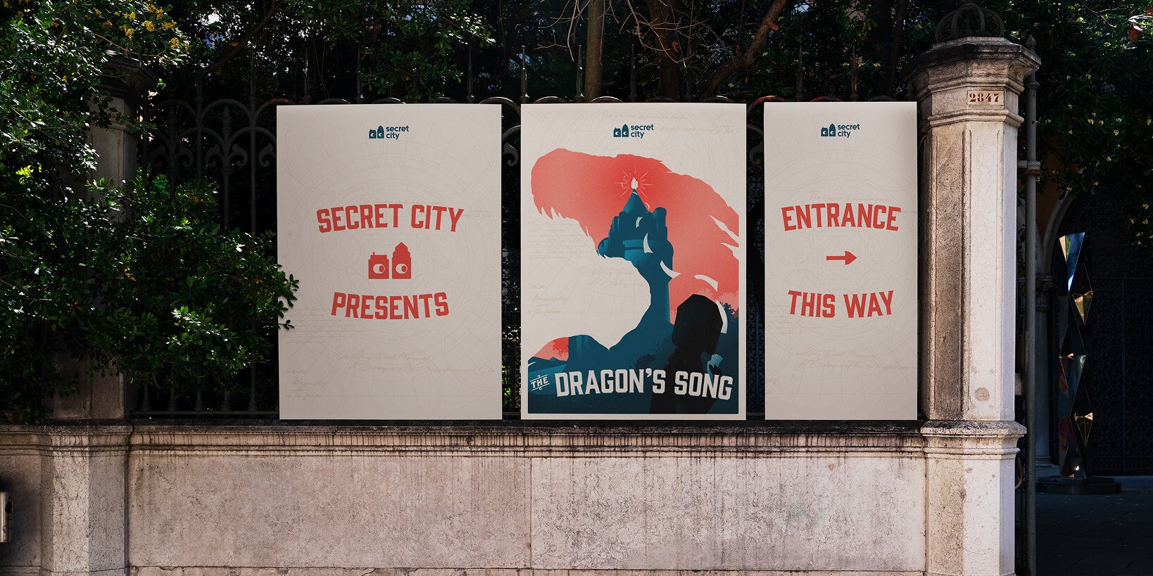
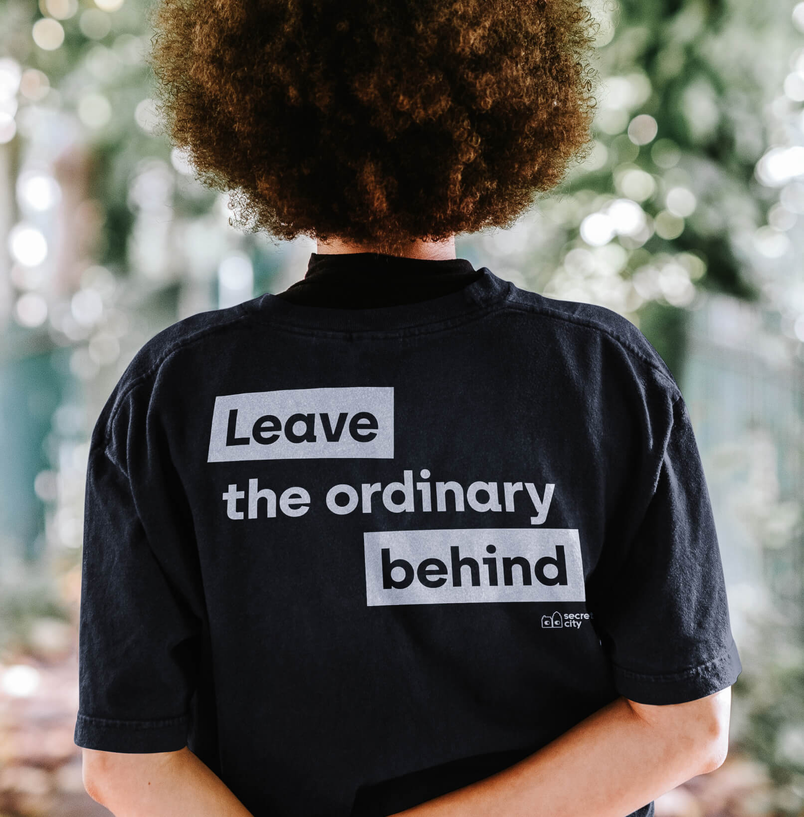
We anchored the identity in playful mystery, curious without being cryptic, theatrical without tipping into dark. The “curious city” concept emerged early and quickly became a shared favourite: a wordmark and icon pair with a sense of discovery baked right into the letterforms. Refined through close collaboration with the Secret City team, the mark balances optimism with intrigue, exactly the spirit players feel the moment they walk through the door. From there, we extended the system across their all of their marketing channels from digital to out-of-home and extended their new brand into new illustrated posters for all of their subsequent game properties, giving every corner of their world a consistent sense of character.


Many thanks to our fabulous partners
Tina Keenan Santiago & Patrick Keenan