Offline
|
EST 00:11:35
|
Toronto

There’s an endless debate on what digital spaces should look like, and how should they work. There has been some great writing on the matter, but the topic will never reach a definitive end because — due to the nature of the technology it relies on — it will always be in flux. Five years ago there was an eruption of enthusiasm about the radical idea that maybe pixels shouldn’t pretend to be made of leather. We reached a watershed moment that allowed us to unload the baggage of old metaphors and create new ones. In the intervening years we’ve developed a new set of mental models that are much more practical, in ways both refreshing and frustrating.
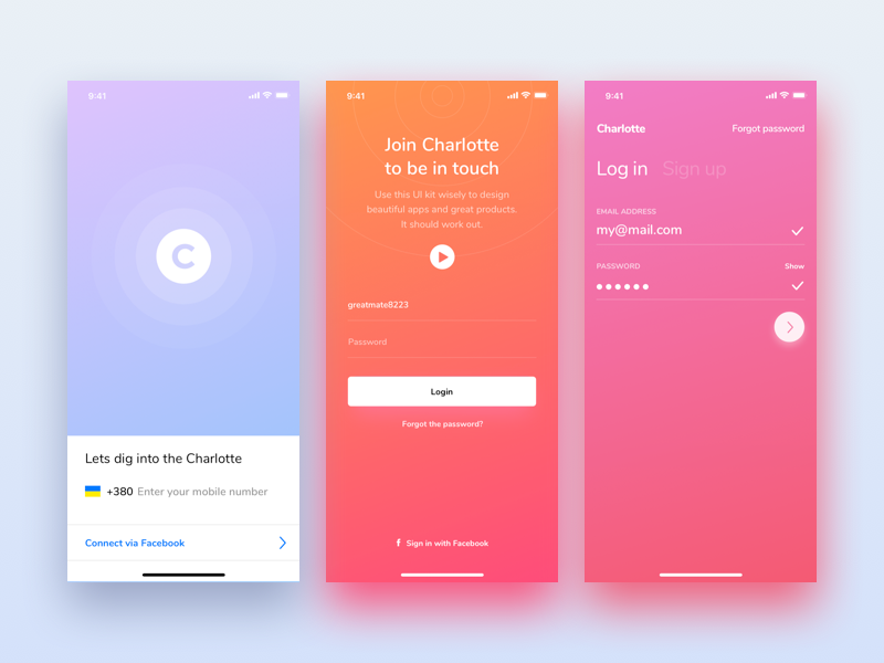
The dominant conclusion was that spatial metaphors are still extremely useful. Communicating depth is the most effective way to establish hierarchy in a digital space because the user will typically be interfacing with some degree of motion or temporality, so helping them create a sense of place is going to make understanding those informational contexts a lot simpler. The second conclusion is that while leather, wood and other natural materials don’t make sense as the building blocks of digital spaces, the importance of texture is very much alive. Matías Duarte, Google’s vice president of design, suggests that digital spaces should emulate a form of magic paper that adheres to the physics of an imperceptibly thin material. Apple and Microsoft suggest that layers of information should be literal layers, and that they should all work to provide a sense of space from the top layer to the bottom. Frosted glass in Apples ecosystem and translucent ‘Acrylic’ for Microsoft have in the intervening years become the dominant textures of digital spaces. It’s a logical end result. The translucency allows for a kind of digital object-permanence, to show that just because you are currently somewhere else, the previous state still may be relevant and retrievable. The blurred effects ensure that legibility isn’t compromised in the process. The softened, hazy colour planes create a new aesthetic underneath that, which become the look of these spaces. Coming off the heels of the austere flatness of the last 5 years, the radiating colours and fluid textures feel comparatively vibrant and luxurious.
The design decisions of these three companies, as platform holders, almost always become bibles for many designers who adapt their own work to feel native to these ecosystems. And many of these designers treat the design decisions of their platform owner as a sandbox to play within, and instead of introducing new & complimentary ideas, instead push and pull the tools at hand to create more radical versions of the first party designs. I’ve noticed a trend emerge that takes the practical sensibilities of these conceptual frameworks and and adapted it into a new, opulent aesthetic for itself.
The characteristics of this trends are easily identified. Diffuse, deep drop shadows are used throughout the designs that over-emphasize depth to give foregrounded content a feeling of very direct importance. Gauzy colours in lush gradients are used to show off entire rainbows of hues to delight the senses. There is a softness — an ethereal, floating quality — to these designs that make you feel comfortable, in an ecstatic way.
The colours themselves fit on a visual spectrum between Californian sunset and an oversaturated aerobics VHS, taking full advantage of the RGB spectrum in all of its florescent glory. And keeping with the spirit of these neon hues, some designers replace the conventional depth-indicator of drop shadows and with soft-coloured glows. Suggesting that the these colours are so vibrant they can’t be fully contained within the bounding box they’ve been placed within.
The most fascinating contributor to this trend is Microsoft who, rather than walking in Apple’s shadow, has created the most ambitious corporate design system I’ve ever seen. It’s light on concrete rules but makes up for it with possibility and bombast.
Fluent Design, as Microsoft calls it is the logical extreme of all of these ideas. If you want depth, you get shadows, elements that jump forwards to meet you, textured translucency. If you want movement, elements can flip, snap, shrink, pop or any other verb you can think of. And if you ever get lost, look for the elements that glow.
There are many things I think are very interesting about this style. Digital spaces have always been saddled with the expectation that they should be functional above everything else, and all of these decisions are still functional, but not any more than they are exuberant, joyous and fun. I appreciate beauty in design above everything else, and it is hard to argue that these are not beautiful.
However, there’s carelessness to their application that I find problems in. There’s frequently an ideological divide between interface design and other areas of visual design. Interface design is often concerned with a more universalized approach to solutions. That the mechanism for how something works shouldn’t necessarily be different on a case by case basis if the content has the same intention, and that if a solution is promoted up the ranks to become a standard, it should be used in the majority of cases regardless of the individual character of the situation at hand.
When it comes to how something works, like whether or not to provide visual feedback on interactive items or to have predictable animations that relate to common actions, it’s often the case that the universal should be applied. But there will never be a universal style, and so applying an interface trend outside of the specific context where it culturally or visually makes sense is clumsy and careless at best and offensive at worst.
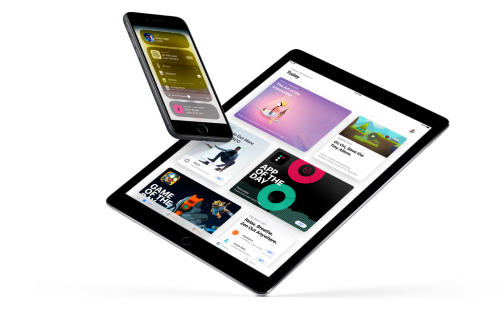
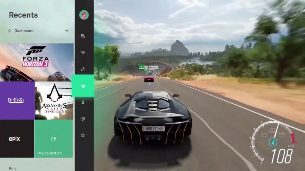
You can take a look at the examples above. The dashboard of a game console of course should have vibrant, stimulating motion, because it matches the expectations of the users. A store that highlights the newest and best software should equally be proud and visually stunning.
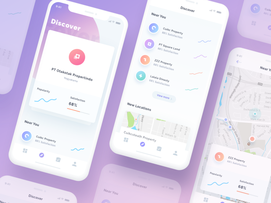
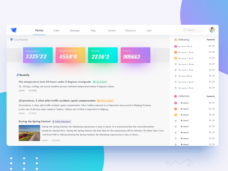
But is the most effective decision to have an app that helps you find property developers pull its inspiration from a daytime disco? Is it relevant, considerate or useful to have a Traffic Information Network display its information in lollipop neon haze?
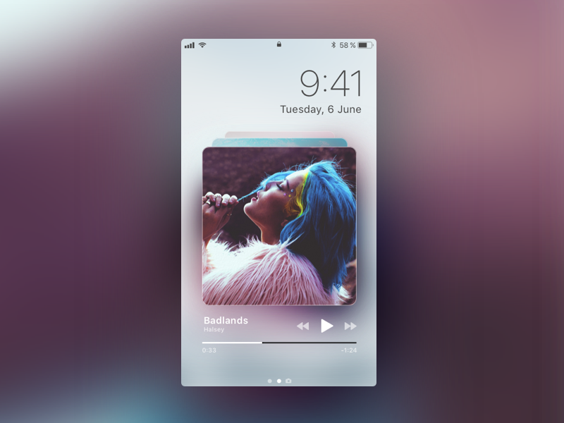
Even in a music streaming platform, where these dreamy, gauzy vibes matches so much of the visual landscape we associate with modern music, still has to contend with the fact that just as many people may be listening to low-fi, rustic folk music or black metal just as frequently. The same designer most likely wouldn’t suggest that their music streaming app should take their sole inspiration a hardcore album cover, so why would visuals that are distinctly pop be any more appropriate? No design decision is neutral. Particularly not the ones that are made to be seen. User interface design can and should be creative. Even more than it is today. But it should be in support of considered, thoughtful decision making, not the arbitrary evolution of a visual trend. There are instances where this type of visual approach is fantastic, but it’s at the mercy of the content that it represents. Screens have no choice but to display what is created for them. They do not care if it is glowing, grainy, flashy or dull. It falls on the shoulders of the designer to carefully and consciously decide.